Vaden Patient Portal Re-Brand
For: Stanford University
Class: DESIGN 141 - Product Design Methods
Quarter: Winter 2023
Length: 4 Weeks
Tools: Figma
Skills: User testing, heuristic evaluations, user flow diagrams, UX/UI mock-ups, wire-frame creation, brand updating
Type: Team Project
Why?
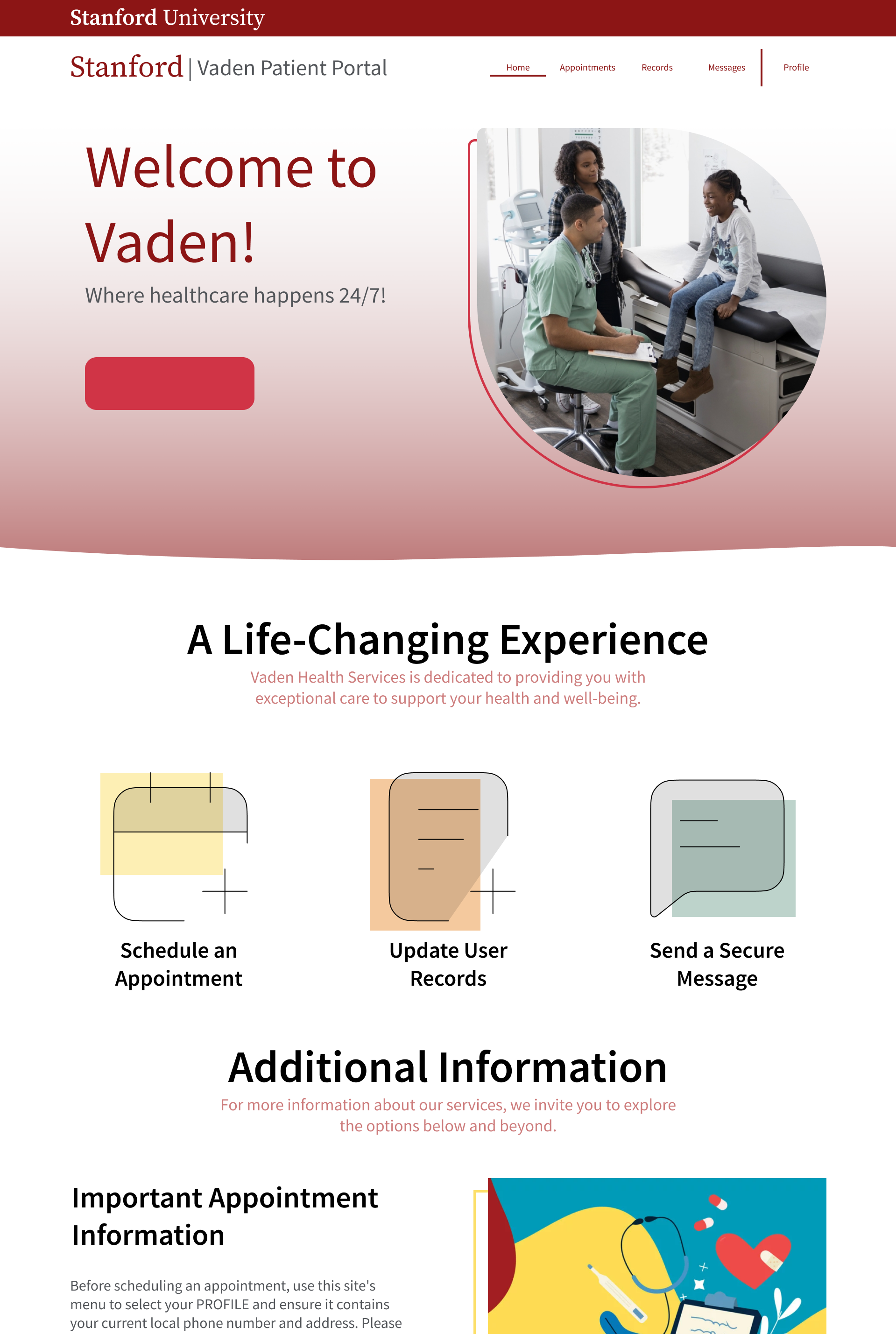
Redesigned the Vaden Patient Portal using heuristic evaluations, user testing and UX/UI mock-ups to improve usability, navigation flow, and overall intuitiveness.
Maintained Stanford’s brand identity while refreshing the visual design to be more engaging, user-friendly, and lively.
Identify Problem and Users
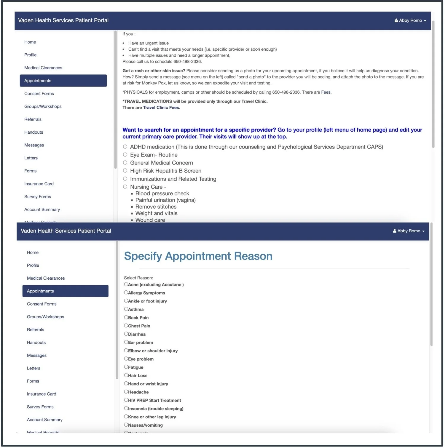
The Vaden Patient Portal is an essential tool for Stanford students (user) to schedule appointments, contact healthcare providers, and upload medical information, among other health-related tasks. The current website is confusing and hard to navigate.

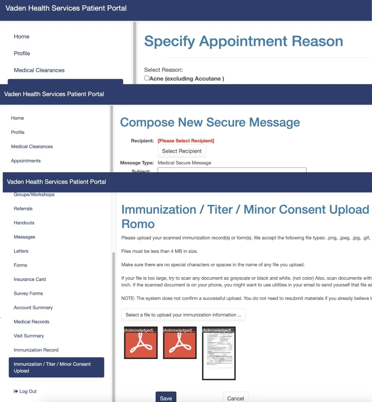
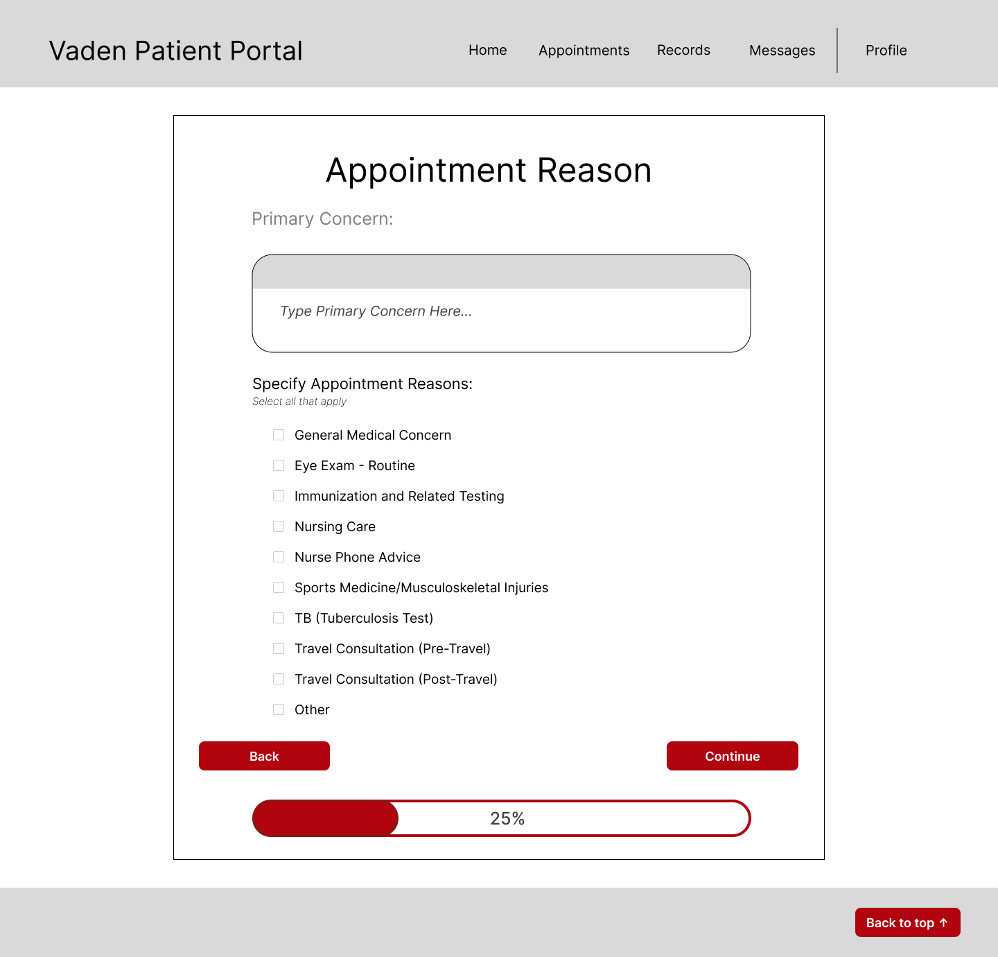
Original/Current Vaden Patient Portal Design:

Flow Diagram
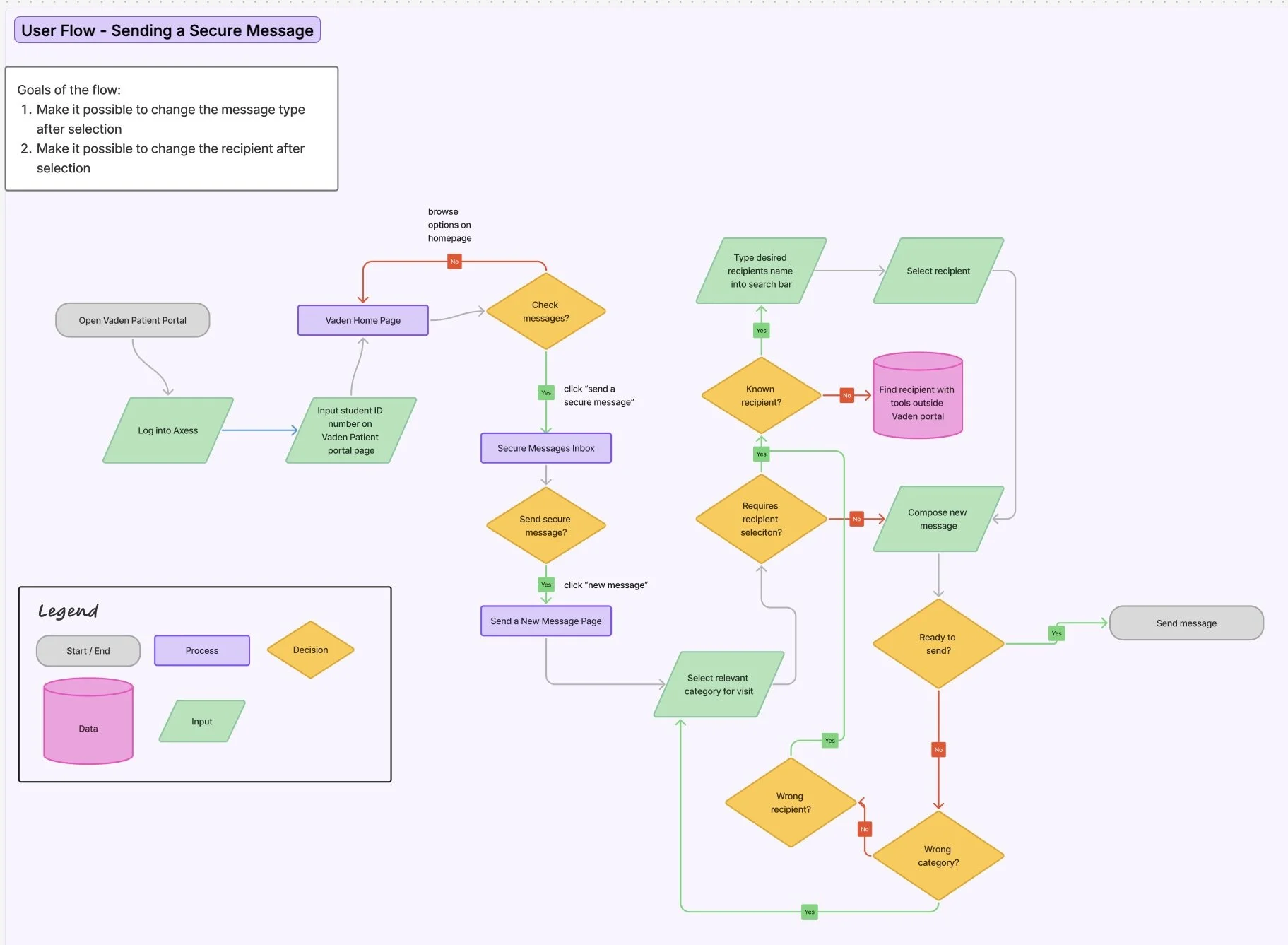
Flow Diagram: Caelan Koch and Liv Alyn
Paper Wireframe Prototyping
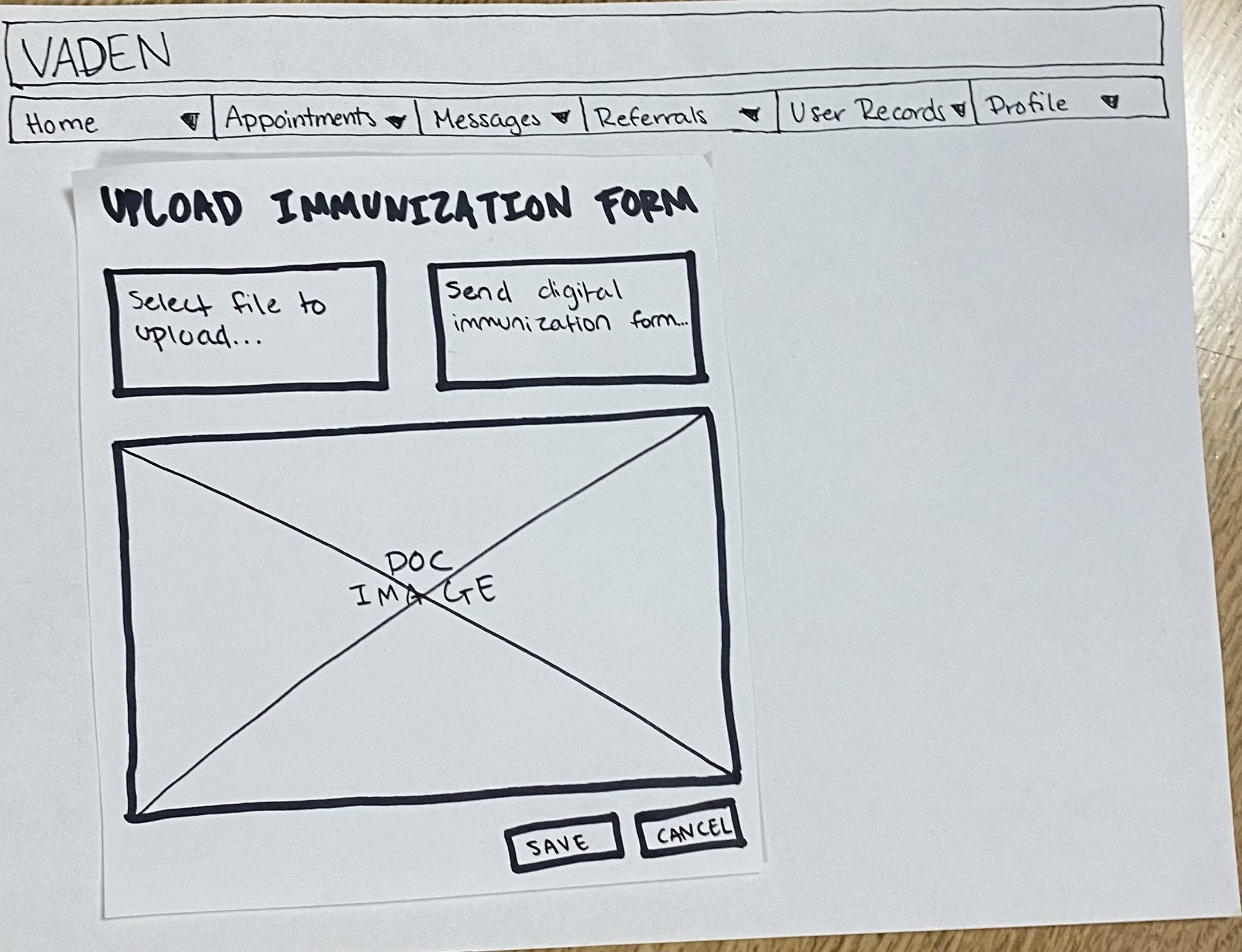
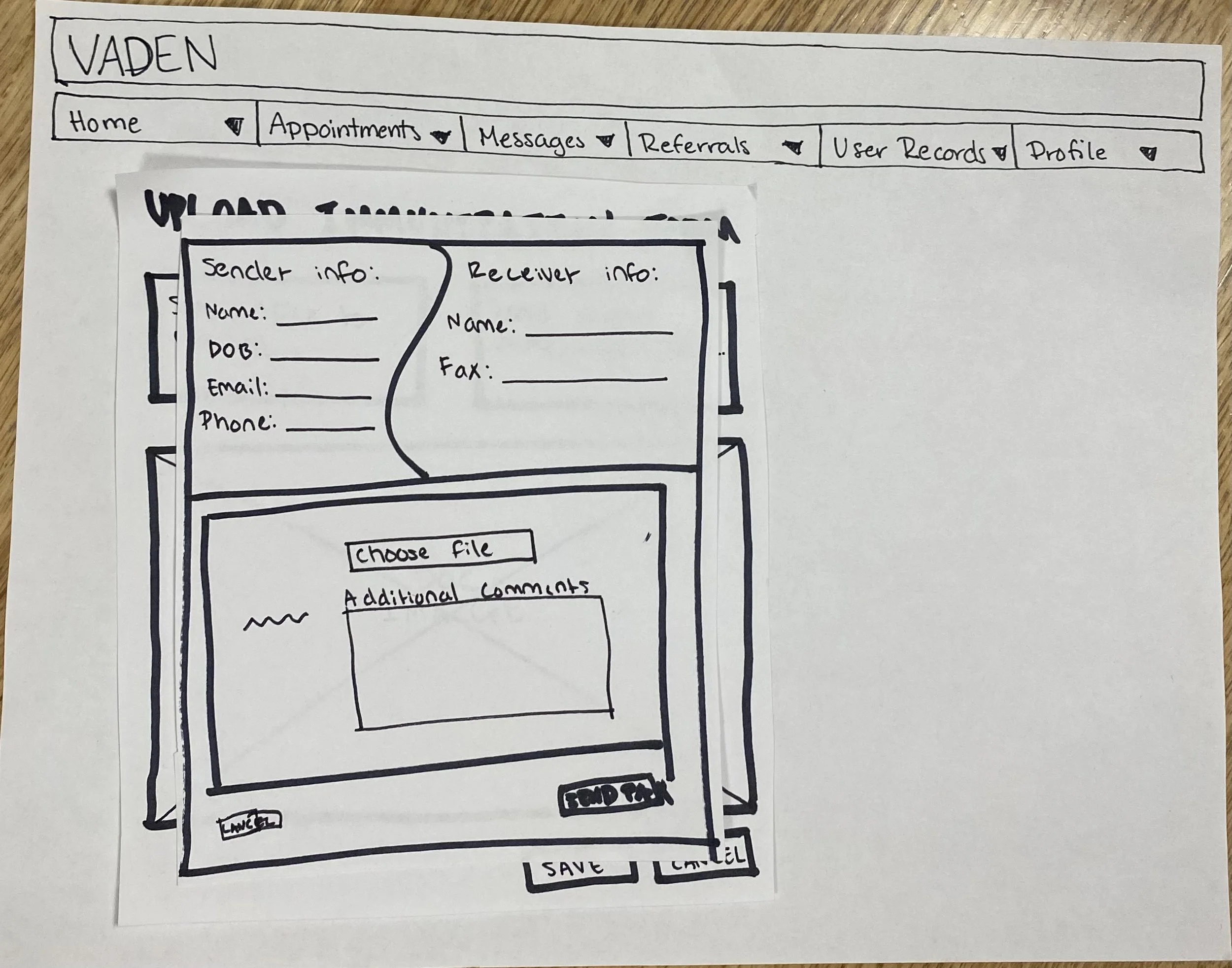
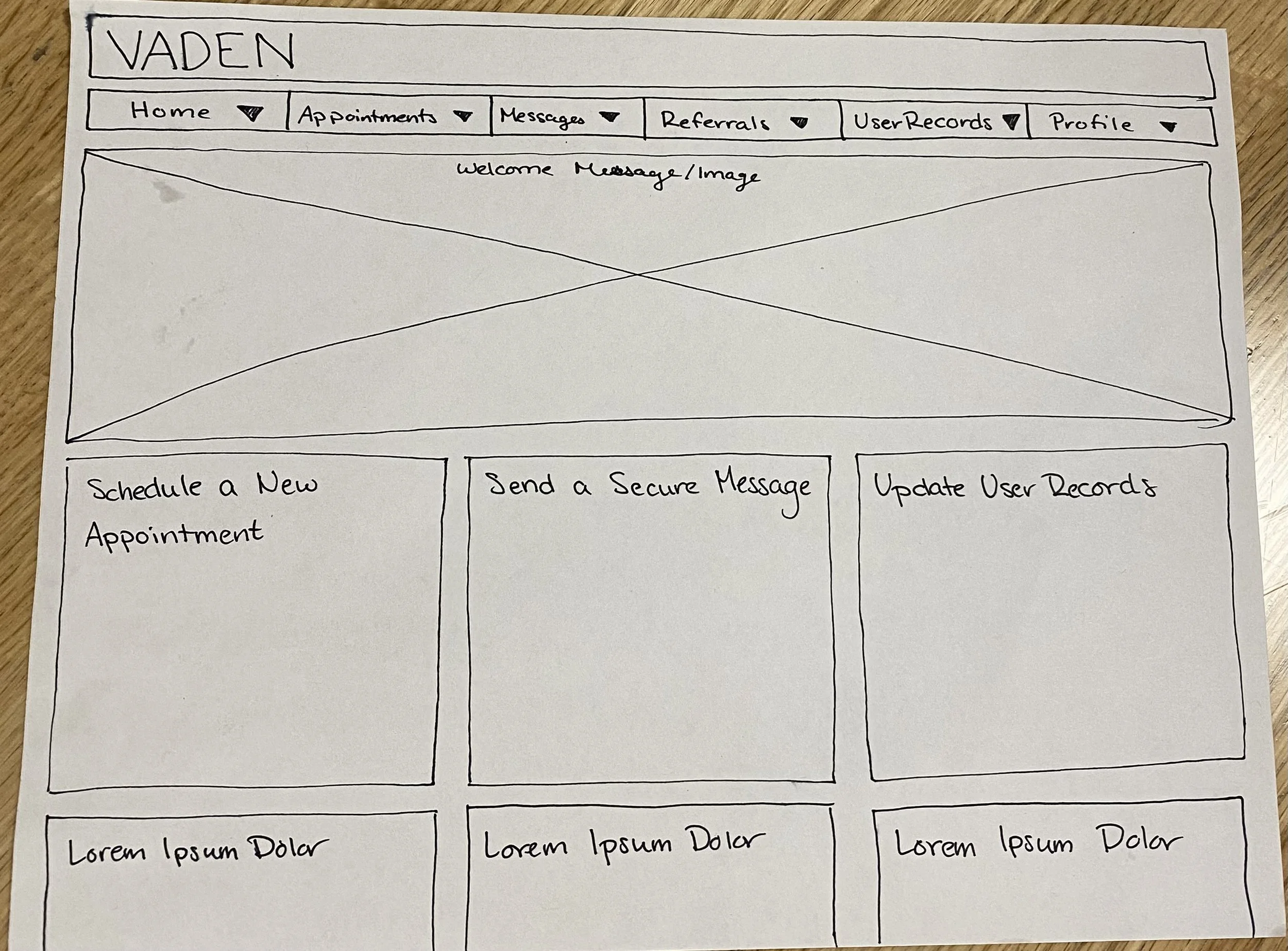
Paper Wireframes: Caelan Koch, Ulises Medina, Liv Alyn
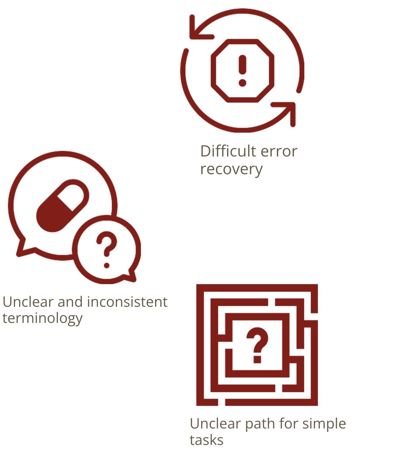
Heuristics Evaluation
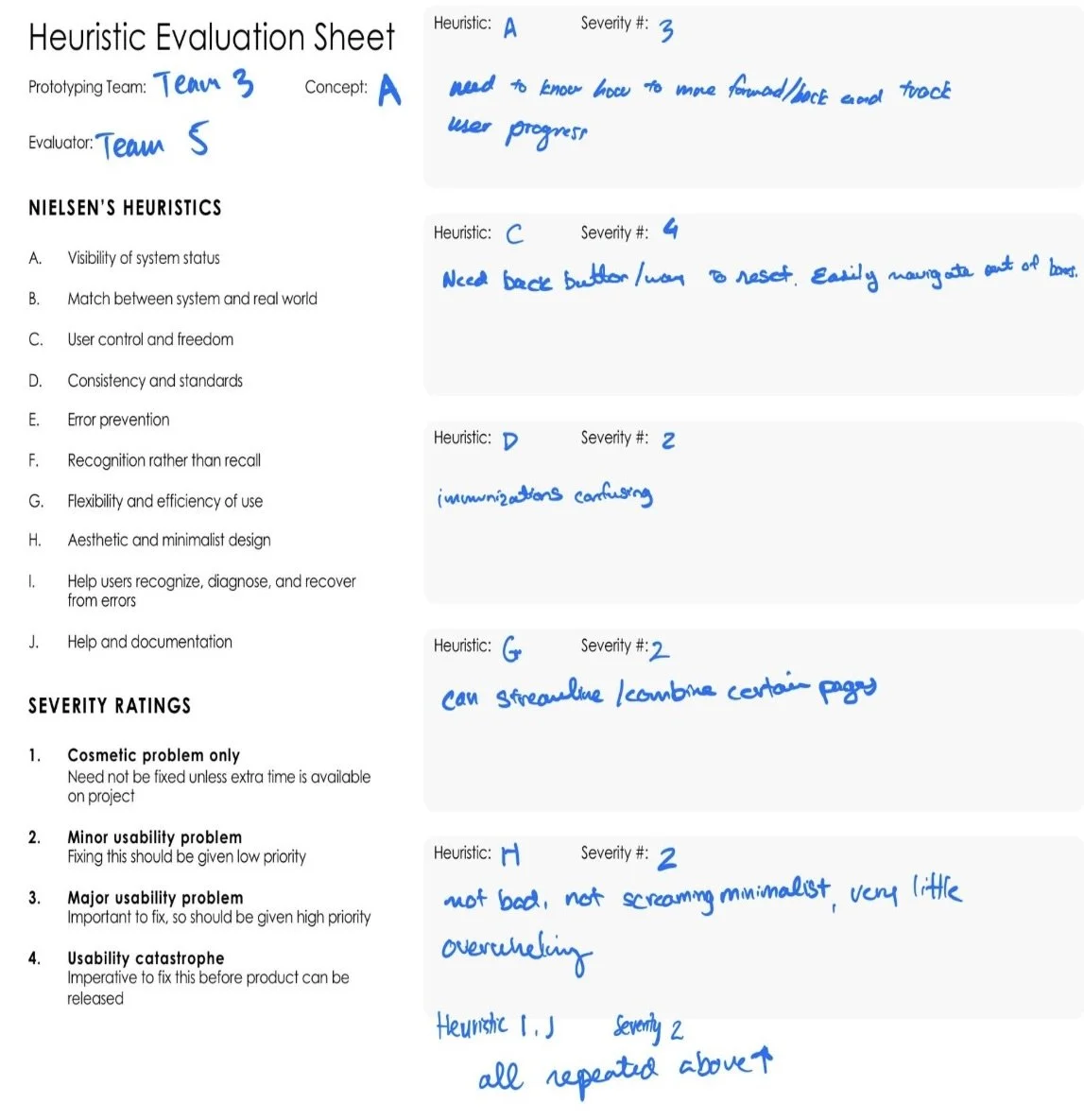
Heuristic A: Visibility of System Status
Heuristic C: User Control and Freedom
Heuristic D: Consistency and standards
Heuristic G: Flexibility and Efficiency of Use
Heuristic H: Aesthetic and Minimal Design
Heuristics - broad rules of thumb!
Nielsen’s Heuristics - fundamental, broad rules of thumb for interface design that improve user experience by ensuring systems are intuitive, efficient, and forgiving.
Heuristic Evaluations: Caelan Koch and Abby Romo
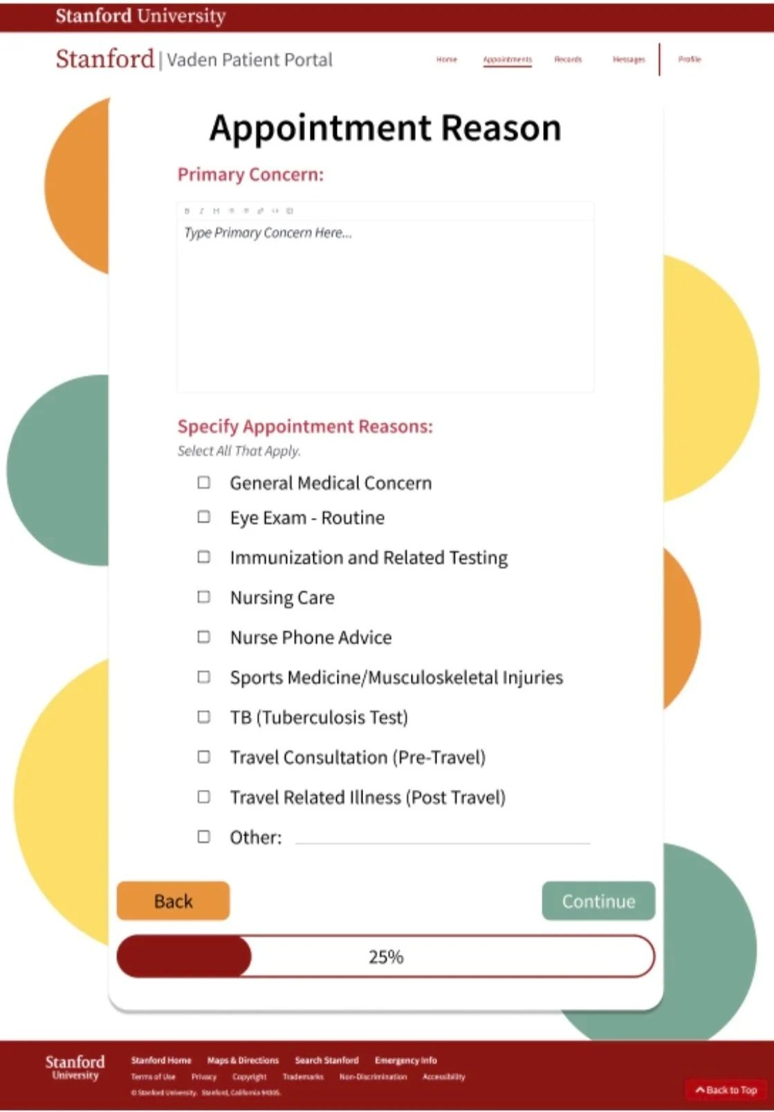
Wireframe Redesign
Old design
Multiple pages
Lots of confusing selections
New Design
Horizontal menu bar
Fewer options
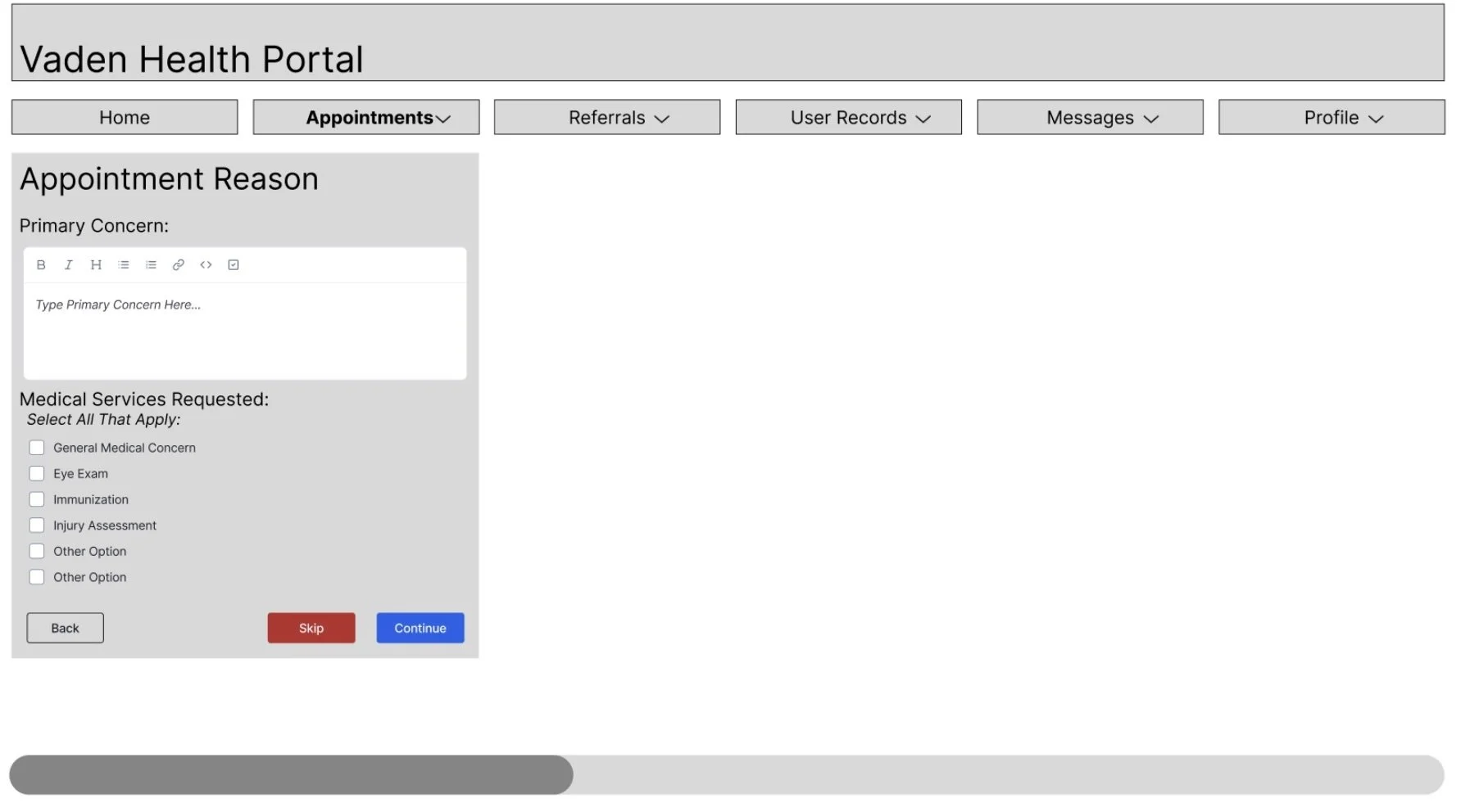
Space for user input
Progress bar
Back / Continue buttons
Wireframe Redesign Ideas: Team Effort
Wireframe itself: Ulises Medina
Updated Wireframes - Caelan Koch
Link to Figma prototype demo:
User Testing
Make Text Bigger
Difficult to read/see text
“I have to squint to read it” - Mathi
Turn little boxes into taking up the entire page
No need to restrict our space, makes it difficult to navigate / read
Add checkpoints to the progress bar; make it clear it’s changing
No one noticed it; needs to grab attention
Add explanation for or remove skip function
“It’s not clear what you’d use it for” - Natalie
Our home page was set up well in that the most important tasks were right in front of you to click on
“Pretty easy to find all tasks” - Natalie
“Flow through the website worked well” - Natalie
“The home page is a good standard design for a lot of websites” - Viruni
User Testing: Team Effort
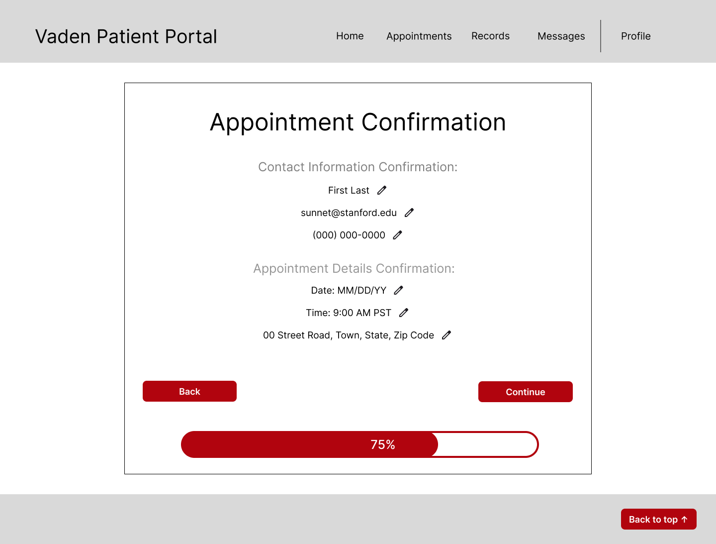
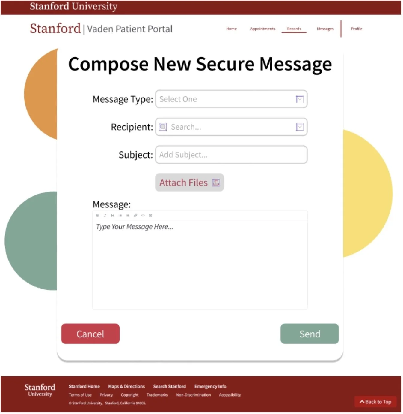
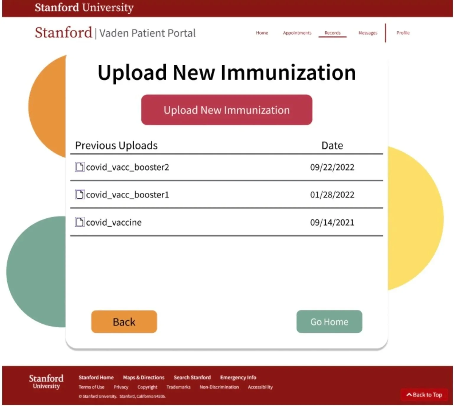
Final Design & Best Features
Toolbar with clearly labeled selection choices
Text box to further explain medical issue
Multiple selections on one page to reduce unnecessary steps
Back button to easily navigate through process
Progress bar for status visibility
Stanford Identity guide/visual brand standards used -
https://identity.stanford.edu/design-elements/color/accent-colors/
Final Wireframes: Ulises Medina